CLIENT
MIODU WARTE
[HONEY]
2021
MIODU WARTE
SERVICES
Branding & Visual Identity
Packaging & Product Design
Digital & Print Collateral
CREDITS
Photography: Krystian Daszkowski
WEBSITE
ABOUT THE BRAND
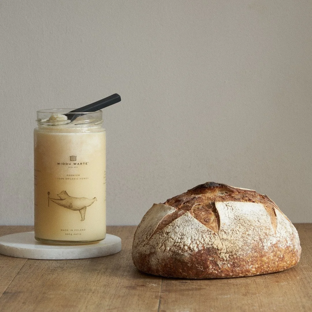
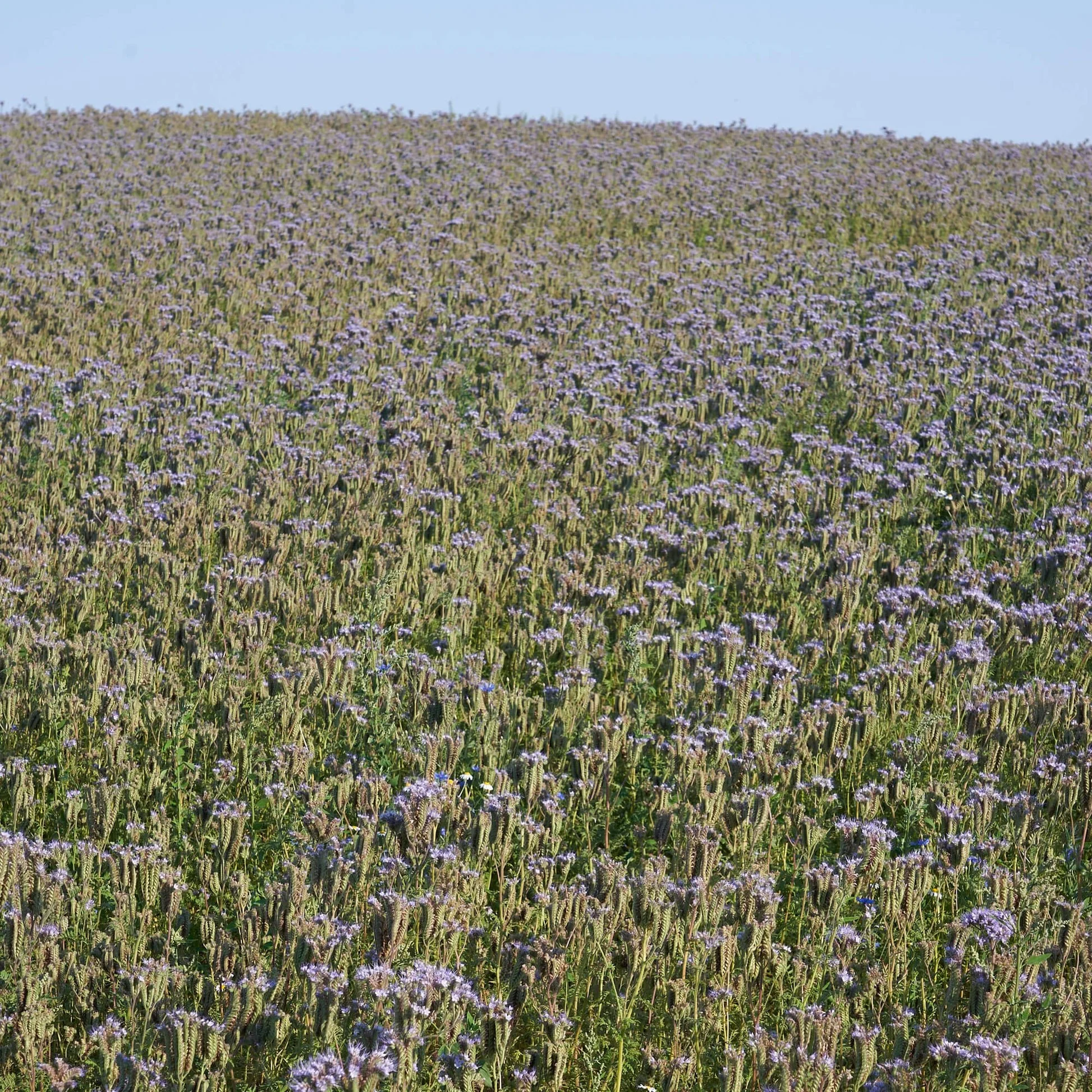
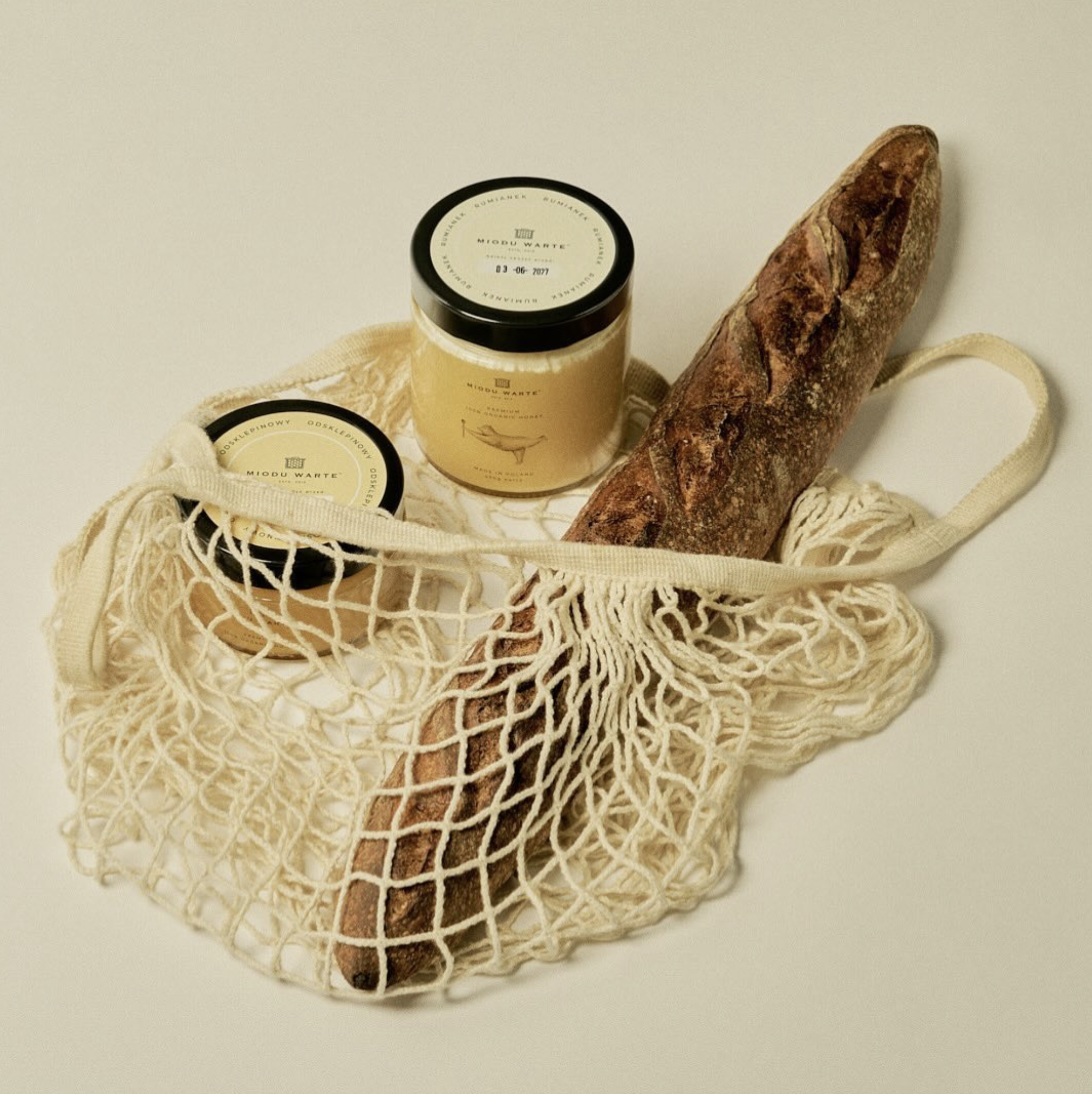
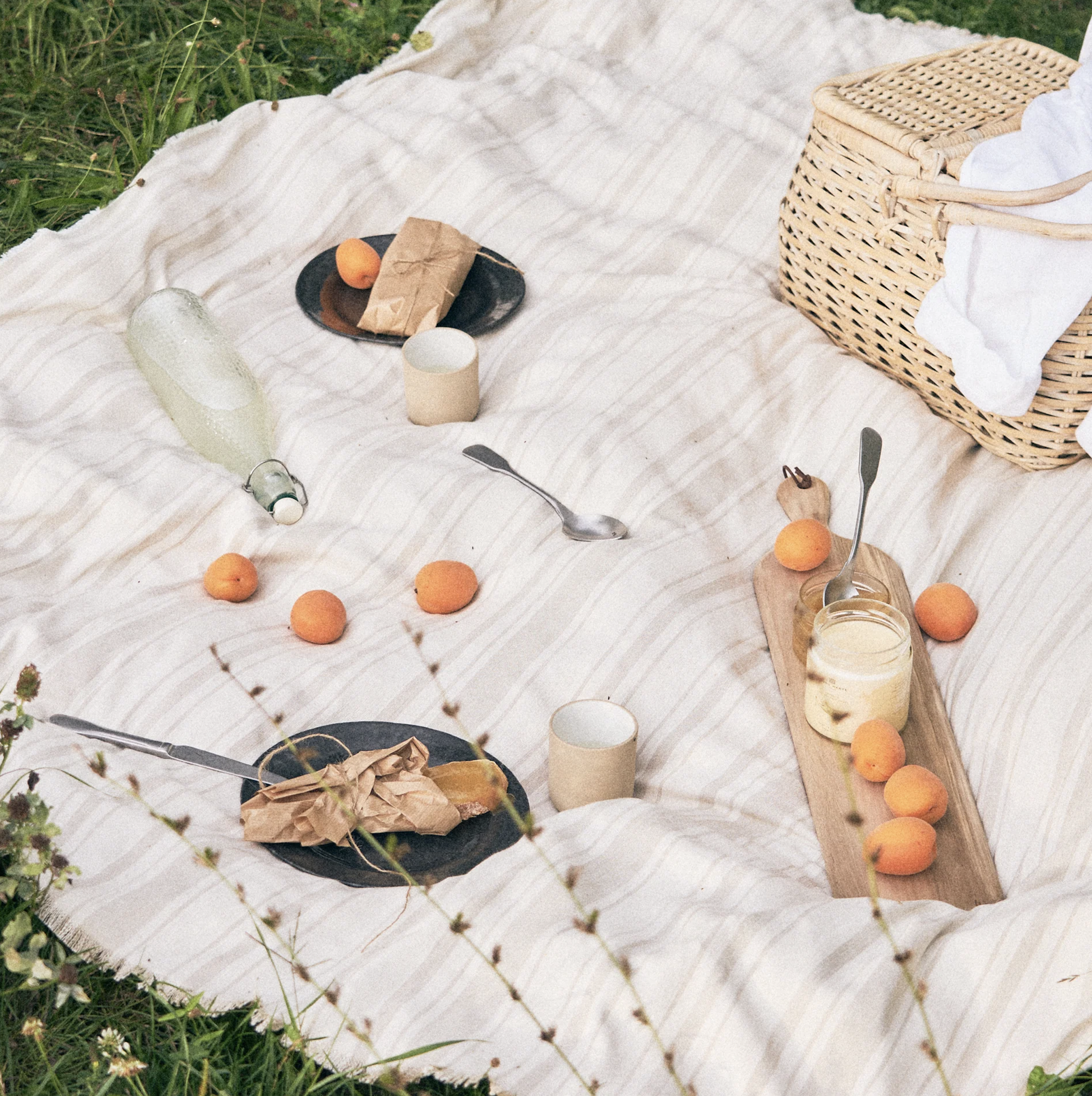
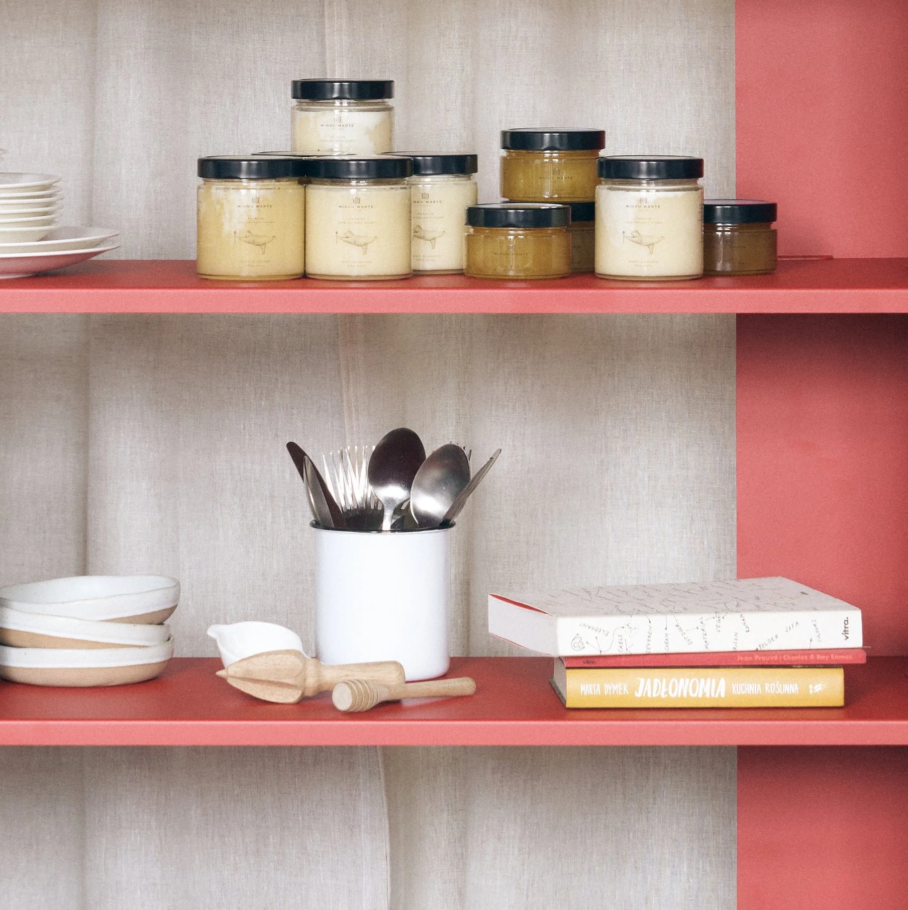
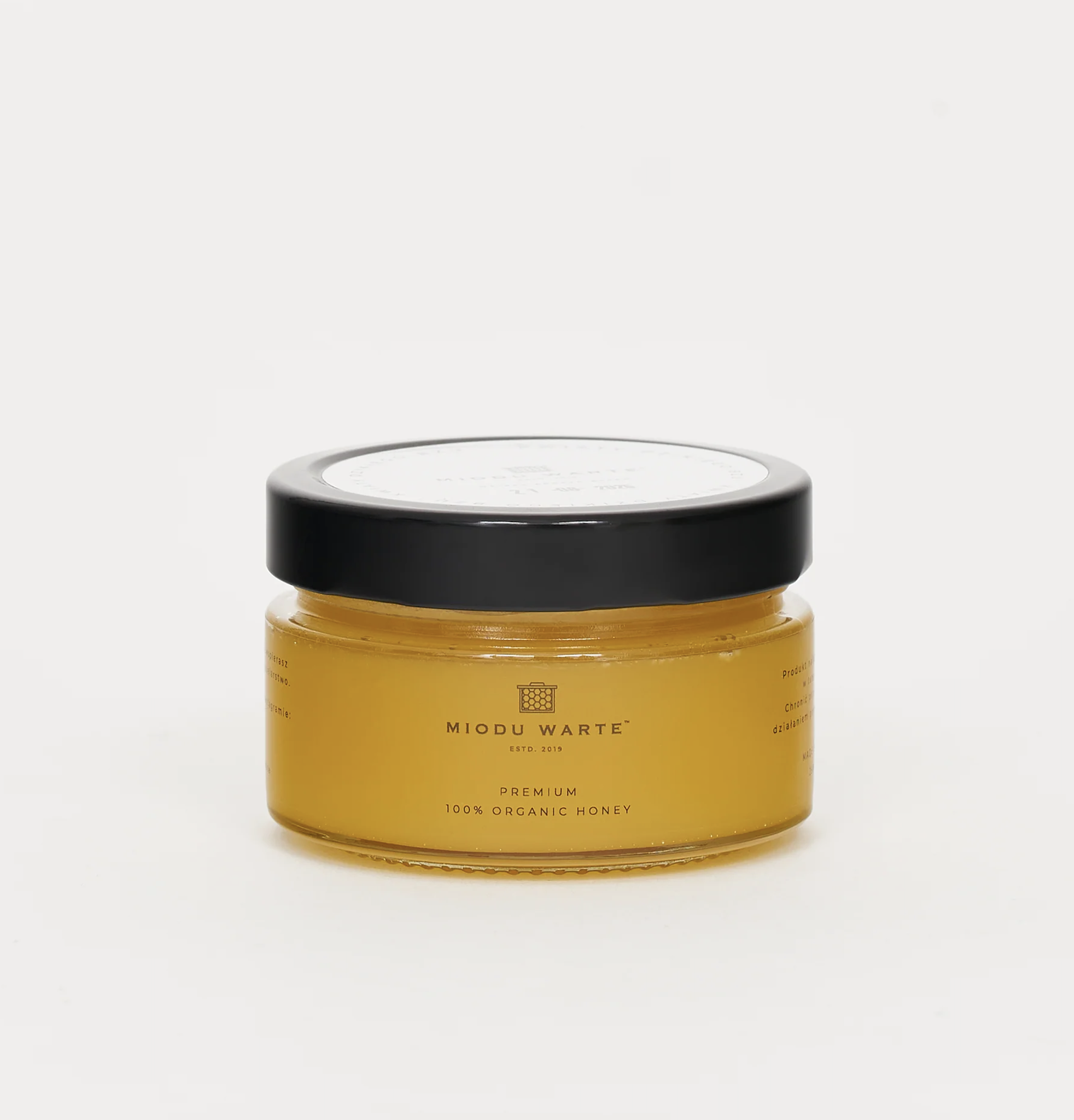
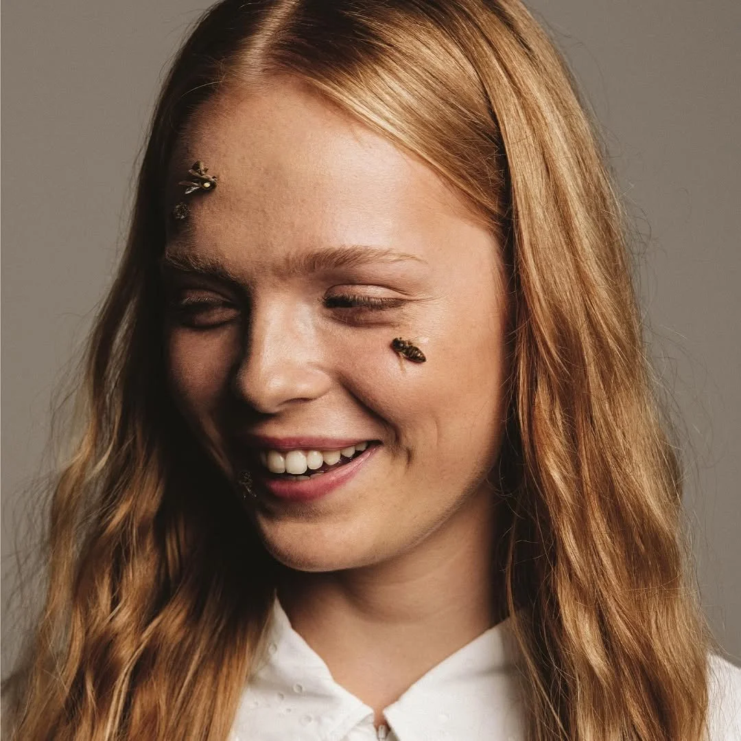
MIODU WARTE is a honey brand rooted in respect for nature, bees, and natural cycles. Its philosophy is based on ethical beekeeping, small-scale production, and minimal human interference. Honey is treated not as an industrial product, but as a natural gift that should remain pure, seasonal, and unprocessed. The brand values sustainability, biodiversity, and harmony with the environment, drawing directly from the landscapes of the Warta Valley where the honey originates.
PROJECT BACKGROUND
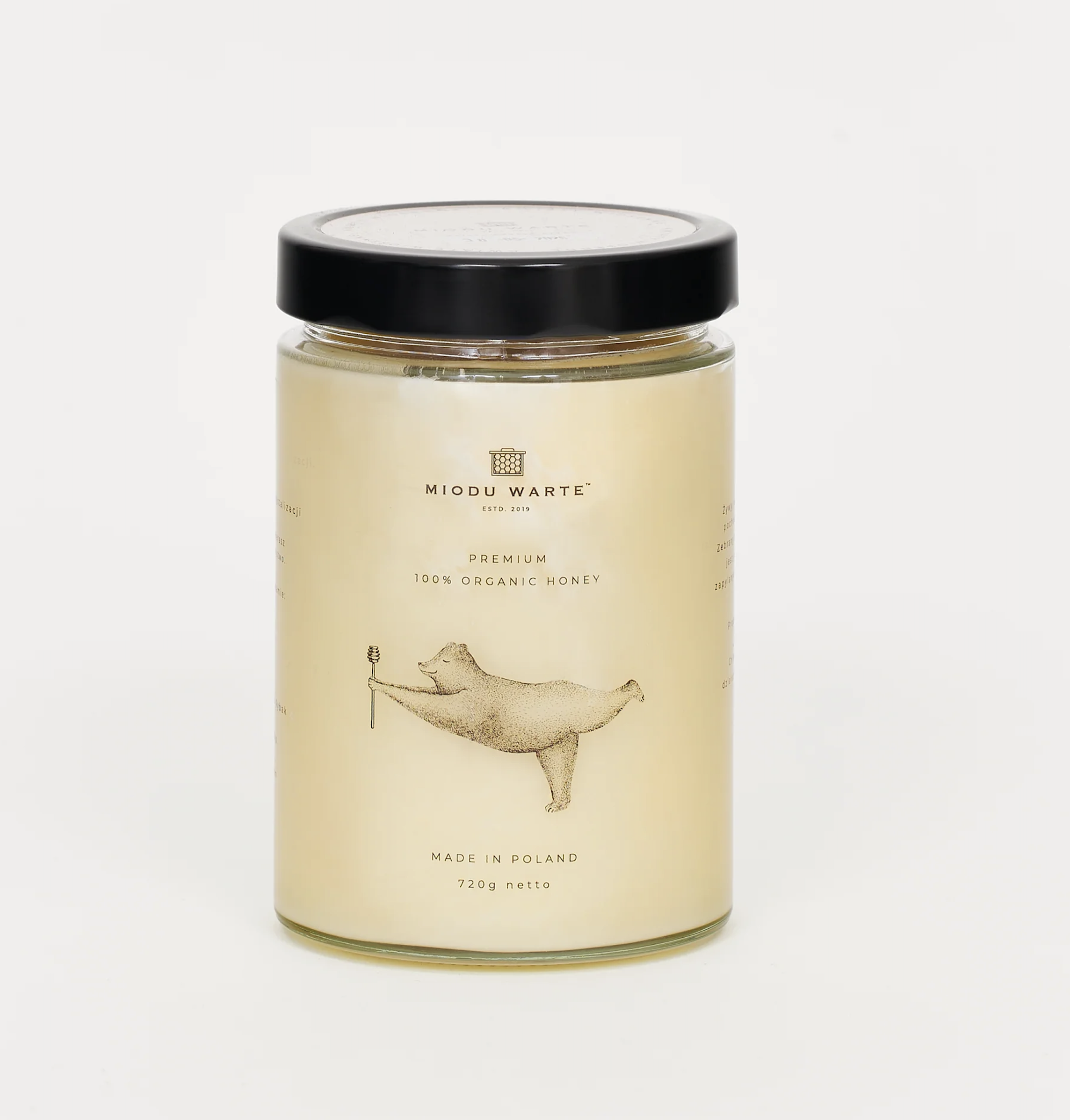
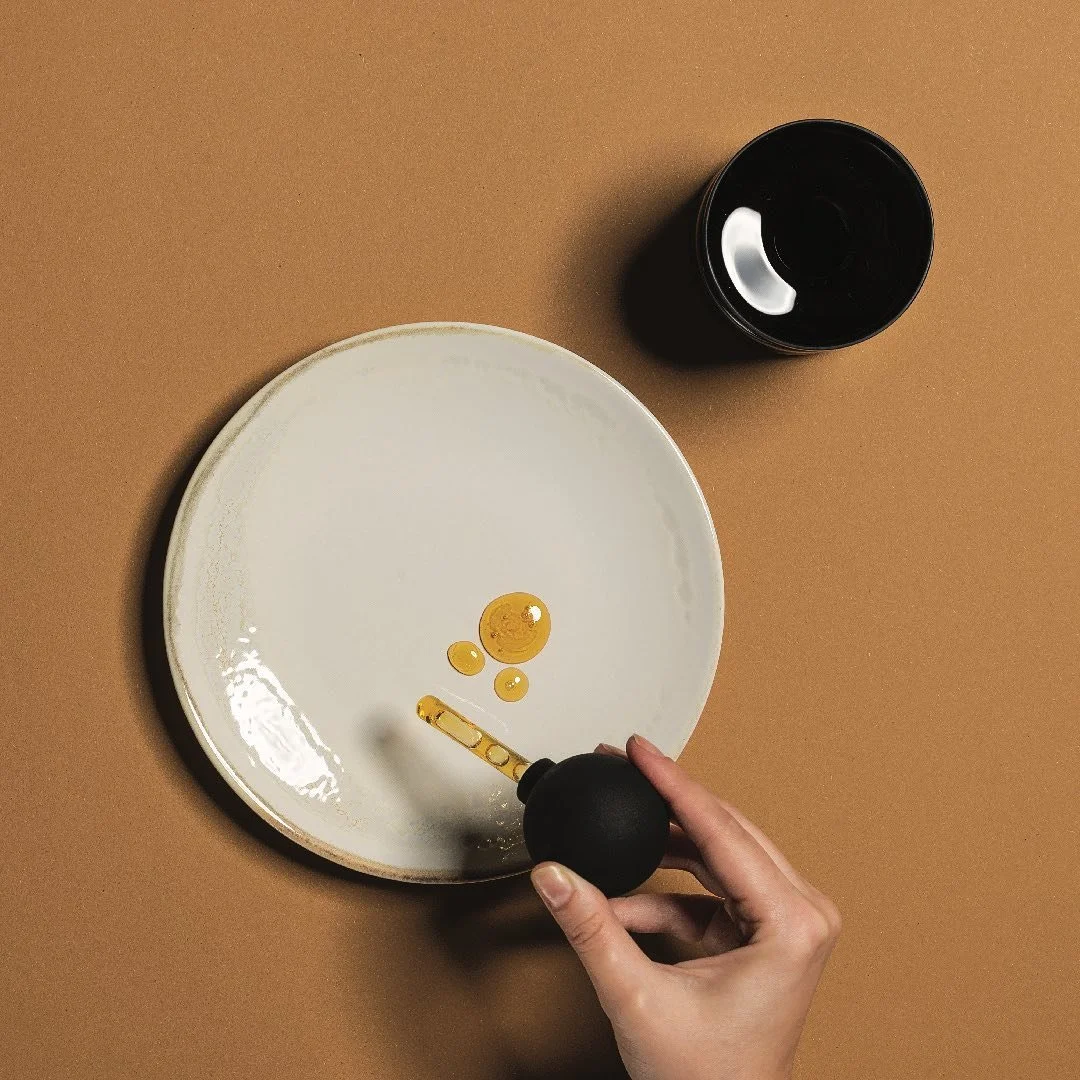
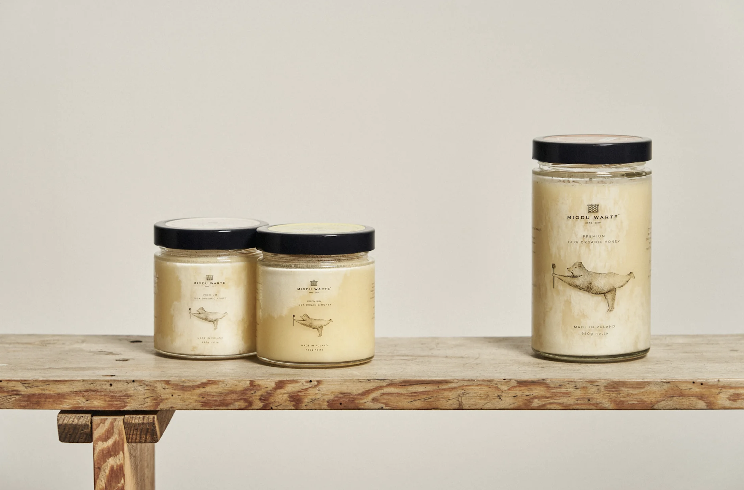
The visual identity was created to translate these values into a calm, honest, and timeless design language. Inspired by natural textures, organic forms, and muted color palettes, the system avoids artificiality and visual noise. A distinctive graphic element - a bear holding honey on a traditional wooden honey dipper - was introduced as a symbolic brand character. The bear represents care, warmth, and respect for nature, while the wooden dipper emphasizes craftsmanship, tradition, and the natural origin of the product. Together, they create a recognizable and memorable visual signature that sets the brand apart while remaining aligned with its ethical and nature-driven mission.